Content
Sampling from asymmetric distributions
We have examined the distribution of the sample mean when taking samples from Normal and uniform distributions. Both these types of population models are symmetric. Now we consider taking samples from distributions that are not symmetric.
Sampling from the exponential distribution
An exponential distribution is 'skewed', with a much longer tail to the right-hand end of the distribution than to the left. Again we use an example introduced in the module Random sampling . In the example, it was assumed that the underlying random variable represents the interval between births at a country hospital; the average time between births is seven days. We assume that the distribution of the time between births follows an exponential distribution. This means that the random variable \(X\) from which we are sampling has an exponential distribution with rate \(\dfrac{1}{7}\), that is, \(X \stackrel{\mathrm{d}}{=} \exp(\dfrac{1}{7})\).
figure 14 shows the model for the time between births in the top panel, and the first of several sets of ten random observations from the model in the bottom panel. The mean for this particular set of ten observations is 6.9 days, shown as a black triangle under the dotplot of the observations. figure 15 shows ten different samples of ten observations, with the sample means. The bottom panel in figure 15 provides a dotplot of the ten sample means.
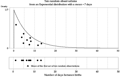
Figure 14: First random sample of size \(n=10\) from \(\exp(\dfrac{1}{7})\), with the sample mean shown as a triangle.
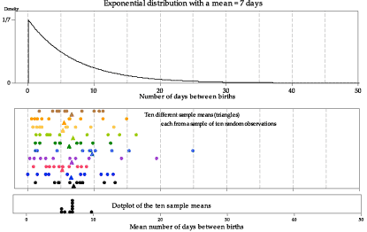
Figure 15: Ten random samples of size \(n=10\) from \(\exp(\dfrac{1}{7})\), with the sample means shown as triangles.
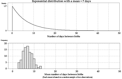
We have looked at just a few samples of size \(n=10\), and represented the sample means obtained in a dotplot. What happens if we take many such samples, and graph the histogram of the sample means? figure 16 shows the histogram of 100 sample means from samples of size \(n=10\). The histogram is somewhat bell-shaped, much closer to being symmetrical than the distribution of \(X\), and narrower.
Detailed description
Figure 16: Histogram of means from 100 random samples of size \(n=10\) from \(\exp(\dfrac{1}{7})\).
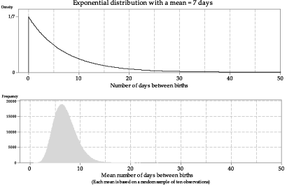
Even with 100 sample means, the distribution is not smooth. To make it smoother, in figure 17 we show the histogram based on one million sample means from samples of size \(n=10\).
Detailed description
Figure 17: Histogram of means from one million random samples of size \(n=10\) from \(\exp(\dfrac{1}{7})\).
Exercise 2
Consider a random sample of size \(n=10\) from \(\exp(\dfrac{1}{7})\).
- Find the following quantities:
- \(\mathrm{E}(\bar{X})\)
- \(\mathrm{var}(\bar{X})\)
- \(\mathrm{sd}(\bar{X})\).
- Relate the mean \(\mathrm{E}(\bar{X})\) of \(\bar{X}\) and the standard deviation \(\mathrm{sd}(\bar{X})\) of \(\bar{X}\) to the histogram shown in figure 17.
The sample means in figures 16 and 17 are based on samples with the small sample size of \(n=10\). figure 17 shows one million means, each based on 10 observations; the histogram of sample means is asymmetric, with a tail to the right.
figure 18 shows the true distribution of sample means for samples of size \(n=10\) from the \(\exp(\dfrac{1}{7})\) distribution, the derivation of which is beyond the curriculum. This is the true distribution corresponding to the histograms in figures 16 and 17.
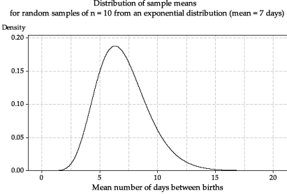
Figure 18: The true distribution of the sample mean \(\bar{X}\) based on random samples of size \(n=10\) from \(\exp(\dfrac{1}{7})\).
What happens if we increase the sample size \(n\)? In figure 19, the means are based on samples of size \(n=50\) and, in figure 20, the means are based on size \(n=200\). In both cases, histograms of a large number of sample means are shown, to get a reliable idea of the true shape. In comparison with figure 17, the histograms of the means are more symmetric and even closer to bell-shaped.
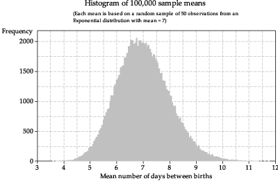
Figure 19: Histogram of sample means from random samples of size \(n=50\) from \(\exp(\dfrac{1}{7})\).
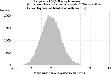
Figure 20: Histogram of sample means from random samples of size \(n=200\) from \(\exp(\dfrac{1}{7})\).
figure 21 illustrates why the histograms of means based on larger sample sizes tend to be more symmetric than those based on smaller samples. The top panel shows a random sample of five observations from the exponential distribution we are considering. There is one relatively extreme observation of 37.6 days; the sample mean based on the five observations, shown as a triangle, is 11.2 days. In a small sample, a single observation in the long right-hand tail of the distribution will have a noticeable effect on the sample mean: it will 'drag it' to the right.
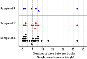
Figure 21: Dotplots of three samples from \(\exp(\dfrac{1}{7})\), with sample means shown as triangles.
The darker vertical line in figure 21 shows the true population mean of 7 days. In the second panel, five more observations are added to the sample; the sample mean for these ten observations is 8.7. This is closer to 7, even though the sample still contains the unusual observation, because the larger number of observations close the mean have a lot of weight in the average.
With yet more observations, the extreme value has even less influence on the sample mean. In the bottom panel, 20 more random observations have been added to the sample, giving 30 in total; the sample mean is \(6.4\), which is closer to the true population mean than the means of the two smaller samples.
Sampling from a strange distribution
So far we have looked at sampling from known, named distributions: the Normal, uniform and exponential distributions. What happens if the distribution from which we are sampling is strange? This is illustrated in figure 22, in which we sample from the weird-looking distribution shown in the top panel.
Exercise 3
Consider the probability density function (pdf) shown in the top panel of figure 22.
- Use the graph of the pdf to check visually (to the extent possible) that the function in the graph satisfies the properties of a pdf.
- One of the following values is the mean of the corresponding random variable. Which is it?
- \(10.1\)
- \(15.4\)
- \(19.0\)
- \(24.4\)
- One of the following values is the standard deviation of the corresponding random variable. Which is it?
- \(4\)
- \(8\)
- \(12\)
- \(16\)
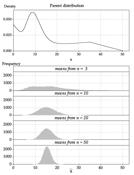
Detailed description
Figure 22: A strange parent distribution (top panel); histograms of sample means based on random samples of various sizes from the parent distribution (bottom panel).
In figure 22, we have bypassed the steps shown previously to show the final result: histograms based on a large number of samples, in order to get a close approximation to the true distribution of the sample mean.
Look closely at the histogram for sample means based on samples of size \(n=3\). Although its shape is quite different from the parent distribution, it is not very close to a Normal distribution: it is quite flat, and it has two peaks.
However, for the sample means based on samples of size \(n=10\), we are seeing — even for such a small sample size — quite a good approximation to the shape of a Normal distribution. For the largest sample size shown here, \(n=50\), the histogram of the sample means has a shape that is distinctly bell-shaped, like a Normal distribution.
