The Improving Mathematics Education in Schools (TIMES) Project
Data Investigation and interpretation 10
Statistics and Probability : Module 8![]() Year : 10
Year : 10
June 2011

It is assumed that in Years F-9, students have had many learning experiences involving choosing and identifying questions or issues from everyday life and familiar situations, planning statistical investigations and collecting or accessing data, and have become familiar with the concepts of statistical variables and of subjects of a data investigation. It is assumed that students are now familiar with categorical, count and continuous data, have had learning experiences in recording, classifying and exploring individual datasets of each type, using tables and column graphs for categorical data and count data with a small number of different counts treated as categories, and dotplots, stem-and-leaf plots and histograms for continuous and count data. It is assumed that students are familiar with the use of frequencies and relative frequencies of categories (for categorical data) or of counts (for count data) or of intervals of values (for continuous data), and that students have used and interpreted averages (that is, sample means), medians and ranges of quantitative (that is, count or continuous) data. Students have used tables and graphs to explore more than one set of categorical data on the same subjects, investigating data on pairs of categorical variables. Students have used stem-and-leaf plots and histograms to explore continuous data (and count data with many different values) and categorical data on the same subjects, comparing features of the continuous data, on the same scale, across categories.
Through learning experiences in many familiar and everyday contexts, students have come to recognise the need for data to be obtained randomly in circumstances that are representative of a more general situation or larger population with respect to the issues of interest. Students have examined the challenges of obtaining randomly representative data, emphasizing the importance of clear reporting of how, when and where data are obtained or collected, and of identifying the issues or questions for which data are desired to be representative. Throughout the Years, students have seen a variety of examples of collecting data, with Years 8 and 9 explicitly identifying surveys, observational studies and experimental investigations, and contrasting sampling with taking a census.
In order to understand how to interpret and report information from data, students have developed some understanding of the effects of sampling variability. Consideration of such effects has been implicit throughout data investigations in all years with more explicit focus and allowance for sampling variability in commenting on data, developing in Years 8 and 9.
Statistics and statistical thinking have become increasingly important in a society that relies more and more on information and calls for evidence. Hence the need to develop statistical skills and thinking across all levels of education has grown and is of core importance in a century which will place even greater demands on society for statistical capabilities throughout industry, government and education.
A natural environment for learning statistical thinking is through experiencing the process of carrying out real statistical data investigations from first thoughts, through planning, collecting and exploring data, to reporting on its features. Statistical data investigations also provide ideal conditions for active learning, hands-on experience and problem-solving. No matter how it is described, the elements of the statistical data investigation process are accessible across all educational levels.
Real statistical data investigations involve a number of components: formulating a problem so that it can be tackled statistically; planning, collecting, organising and validating data; exploring and analysing data; and interpreting and presenting information from data in context. No matter how the statistical data investigative process is described, its elements provide a practical framework for demonstrating and learning statistical thinking, as well as experiential learning in which statistical concepts, techniques and tools can be gradually introduced, developed, applied and extended as students move through schooling.
In this module, in the context of statistical data investigations, we build on the content of Years F-9 to extend the focus in Year 9 on comparing quantitative data across the categories of one or more categorical variables, and to extend the exploration in Year 6 of association between categorical variables, to exploration of possible relationships between continuous variables.
Quartiles and boxplots are introduced and used to further develop the learning experiences in comparing quantitative data across categories of one or more categorical variables. Boxplots are compared with histograms, and the relative merits of the four types of plots for quantitative data (dotplots, stem-and-leaf plots, histograms and boxplots) are compared. Comparisons are made with regard to location, spread and shape, with reference to plots and/or the summary statistics of sample means, medians, quartiles and ranges, as appropriate.
Scatterplots are used to investigate and comment on possible relationships between continuous variables. Examples include situations involving time, and examples from digital media illustrate graphical techniques for exploring more complex situations with social, environmental and health ramifications.
Count data with many different values (usually large values) of counts, may also be explored using the plots and summary statistics that are used for continuous data, because of the many different values. For convenience in this module, we will use the terms continuous data and continuous variable, with the understanding that count data with many different values of counts may also be treated in the same ways. One example on such data − on the number of blinks per minute − is included as illustration.
Throughout this module, students build on their understanding of the importance of clear reporting of how, when and where data are obtained or collected, and of identifying the issues or questions for which data are desired to be representative. In the direct extension of Year 9 content, this module makes use of the Year 9 examples of data investigations initiated, designed, planned and carried out by students. In exploring relationships amongst quantitative variables, this module uses examples ranging from student data investigations to issues of international concern and importance.
Throughout F-10, the examples and new content of modules are developed within the statistical data investigation process through the following:
- considering initial questions that motivate an investigation;
- identifying issues and planning;
- collecting, handling and checking data;
- exploring and interpreting data in context.
The examples consider situations familiar and accessible to students and build on situations considered in F-9.
Summary of student data investigation examples.
The following are brief summaries of some data investigations initiated, designed and undertaken entirely by students, involving a number of variables including one or more quantitative variables and at least categorical variable. These will be used in the examples of this module. Most are used in the examples in the Year 9 module, and more details are provided there, particularly on the details of the planning, practicalities and collecting of the data. The groups of students involved chose their context and the aspects of it of interest to them, identified the variables and subjects of the investigation, planned the practicalities of the data collection to obtain randomly representative data, carried out appropriate pilot studies and collected their data, then explored and reported on their data.
For each example below, the students were interested in a number of questions and issues, only some of which are explored in this module.
Example A: Gogogo!
The students in this group were interested in investigating whether speed of approaching traffic lights tended to be different for green or amber traffic lights and whether this was affected by driver gender, age or vehicle type, colour or make. They recorded data only for vehicles that had free approach to the lights − that is, not impeded in any way by other vehicles. To collect information on speed, they recorded the time in seconds that vehicles took to pass through a 50 metre section just before the set of lights. They also recorded gender and (broad) age group of driver, and colour, type and make of vehicle.
In this module, we consider only the time to travel the 50 metre section (in seconds) and the colour of the lights.
Example B: How often do people blink?
This group of students decided to conduct a simple survey on opinions on a topic such as travel, asking questions for one minute. There were four students in the group and they collected their data in pairs. One member of the pair asked the questions while the other unobtrusively counted the number of times each subject blinked. The students used the same questions, and stayed in the same pairs of investigators to collect their data. The investigators recorded the gender and age of the subject, the number of blinks in the minute of the survey, whether the questions were asked inside or outside, in the morning or afternoon, the subject’s eye colour, and whether the subject wore glasses or not. They also recorded the pair who collected the data for each subject. They discovered during their exploration of the data that this last variable was important. It happened by accident more than design, that the group of two boys and two girls decided to collect their data in same gender pairs − that is, the two girls formed one pair of collectors and the two boys formed the other pair. In this module, we consider the number of blinks per minute, the gender of the subject and the gender of the observer pair, but in practice, as with other examples in these modules, all of the variables are likely to be of interest, and it is likely that combinations of variables could affect the number of blinks.
Example C: optical illusions
There are pictures that can be looked at in two ways. For example, there is a well-known father and son optical illusion (see, for example, http://www.moillusions.com/2010/07/father-and-son-optical-illusion.html ). The group of students who thought of this topic were interested not only in which picture people saw first and how long they took in seeing it, but also whether they were interested in seeing the other picture and whether they were right or left-handed. The investigators also recorded each subject’s gender and age. A brief explanation was given to each subject before showing the picture, namely, “I’m going to show you a picture that could be seen as a picture of an old man or of a young man. Tell me as soon as you’ve seen either the old or the young man, and which one you see.”
In this module, we consider only the variables time to see a picture, which picture was seen and the gender of the subject.
Example D: The flight of paper planes
This student group investigated variables that might affect the distance and the flight time of different designs and materials of paper aeroplanes. The experiment was conducted in an enclosed space to minimise the influence of the weather. Three different plane designs were made using three different types of paper (rice, plain and cartridge), and each combination was thrown four times by each of four different throwers. For each throw, the flight time, distance, type of landing (nosedive/glide), position on landing (upright/not) and whether there had been any obstacles, were all recorded. All flights took place on the same day in the same location. The order in which the planes were thrown was randomised.
In this module, the flight times, flight distance, and the design and paper type will be considered.
Example E: Body statistics
The students conducting this investigation were interested in a variety of body measurement data and the person’s ability to perform unique body-related skills (touching toes, touch nose with tongue, curl tongue). They took nine different body measurements as well as recording gender and age and the three body-related skills. In this module, we will consider head circumference (measured around eyebrows, in cm), age, shoulder width (shoulder tip to shoulder tip, in cm) and gender.
Example F: Reflexes
The group conducted an experiment to investigate human reflexes. A ruler was dropped (from 15.2cm above the hand and by the same group member) on the count of three and the aim was to catch the ruler as quickly as possible. The subjects forearm was positioned perpendicular to the body while the thumb was at right angles with the fingers. A green fluorescent and a clear ruler were used, and each subject was asked to catch each ruler, once each with each hand (right/left). For each subject, a coin toss randomised both the order of which the different rulers were dropped and also which hand the subject would use first. Distances were measured from the bottom of the ruler to the catching position. For each subject, age, gender, and dominant hand were recorded as well as the result for each of their “catches”, including if they missed altogether.
Students have become familiar with the concept and use of medians of quantitative data since Year 7. When the data are ordered from smallest to largest, the median of the data is the “middle” observation, with an equal number of the observations less than it and greater than it.
For an odd number of observations, the median is the middle observation. For example, for 51 observations, the median is the 26th observation after the data are ordered from smallest to largest, because the 26th observation has 25 values on each side of it. Thus for an odd number of observations, the median is one of the data values, and it has half of the rest of the observations on each side of it.
For an even number of observations, any value between the middle two has equal numbers of observations on each side of it, and the convention is that we take the median as the midpoint of the two central values. Hence for an even number of observations, the median is not one of the observations and it has half of the observations on each side of it.
If a stem-and-leaf plot is readily available, it is easy to obtain the median from it. Below are two stem-and-leaf plots for the data of Example B, of the number of times per minute a person blinks, one for the 48 females and the other for the 53 males in the dataset.
Example B: median number of blinks per minute for females and males
Number of blinks per minute for 48 females of Example B
|
Leaf unit = 1.0 |
||
| 0 | 4 | |
| 0 | 78889 | |
| 1 | 111224 | |
| 1 | 55666667799 | |
| 2 | 233333444 | |
| 2 | 5789 | |
| 3 | 334 | |
| 3 | 5789 | |
| 4 | 00 | |
| 4 | 88 | |
| 5 | 3 |
For 48 observations, the median is the midpoint of the 24th and the 25th (ordered) observations. From the stem-and-leaf, we see that the 24th is 22 and the 25th is 23, so the median is taken as 22.5. Note that the variable is number of blinks per minute − a count variable − but we do not round the median to a whole number because it is giving us an estimate of the number of blinks that females are equally-likely to blink more or less than.
Number of blinks per minute for 53 males of Example B
|
Leaf unit = 1.0 |
||
| 0 | 2 | |
| 0 | 56678 | |
| 1 | 1133444 | |
| 1 | 55566677778899 | |
| 2 | 12223344 | |
| 2 | 55668 | |
| 3 | 012244 | |
| 3 | 558 | |
| 4 | 24 | |
| 4 | 7 | |
| 5 | 0 |
For the 53 males, the median is the 27th observation as it has 26 observations of either side of it. From the stem-and-leaf plot, we see that the 27th observation is 19. Note that it is immaterial that there are two values of 19 in the dataset − 19 is still the 27th observation whether we approach it from the top or the bottom of this dataset.
The quartiles divide the (ordered) dataset into halves again, so that the quartiles plus the median divide the dataset into 4 with equal numbers of observations in each “quarter”. Hence, once the median has divided the data into two, with equal numbers of observations in each “half”, then the lower quartile can be thought of as the median of the lower half of the data, and the upper quartile can be thought of as the median of the upper half.
This is illustrated using the above example.
Example B: quartiles for the number of blinks per minute for females and males
For the 48 females, the group below the median has 24 observations. Hence the median of this group is taken as the midpoint between the 12th and 13th observation from the smallest. Looking at the stem-and-leaf plot, this is the midpoint of 14 and 15, and so the lower quartile is 14.5. The group above the median also has 24 observations, from observation number 25 to observation number 48. Hence the median of this group is taken as the midpoint between the 12th and 13th observations from the largest. Looking at the stem-and-leaf plot, this is the midpoint between 33 and 29, and hence the upper quartile is 31.
For the 53 males, the group below the median has 26 observations. Hence the median of this group is the midpoint between the 13th and 14th observations. From the stem-and-leaf plot, we see this is the midpoint between 14 and 15 and hence is 14.5. The group above the median also has 26 observations, from observation number 28 to observation number 53, and the upper quartile is therefore the midpoint between the 13th and 14th observations from the largest. Looking at the stem-and-leaf plot, this is the midpoint between 30 and 28. Hence the upper quartile is 29.
We have seen that the median provides information on where the data are centred or located, and that the overall range from minimum to maximum provides some information on the spread of the data. However, the smallest or largest observation can sometimes be quite a distance from the bulk of the data, and the overall range could be misleading with regard to where most of the data are. A measure of spread that is not as vulnerable to extremes is the inter-quartile range − the distance between the quartiles. This gives the range of the middle 50% of the data.
In the above example, for the females, the median number of blinks per min is 22.5 and the inter-quartile distance is 16.5. For the males, the median number of blinks is 19 and the inter-quartile distance is 14.5. There is little difference between females and males, with the females having a slightly higher median and being slightly more variable than the males.
The minimum, maximum, median and the two quartiles, are sometimes called the five number summary. Sometimes the lower quartile is called the first quartile, because it marks the first quarter of the (ordered) data. The median is then the second quartile although this term is very seldom used, and the upper quartile is called the third quartile because it marks three-quarters of the way through the data from smallest to largest. These five summary statistics are the key information in a boxplot which is explained via the diagram below.

The above diagram is the simplest form of boxplot, but it has a disadvantage in that there is no information on how far the minimum and the maximum are from the rest of the data. A version of the boxplot more often used in statistics draws the “whiskers” from the box to the data points that are within a certain distance from the edges of the box, and marks the data points that are outside this distance by *’s. The boxplot below illustrates this for the overall dataset of Example B.
boxplot of number of blinks

If the inter-quartile distance is denoted by d, then the whiskers go out to the last data point inside the distance 1.5d from the edges of the box. Any data points outside this distance from the box are marked by *’s.
We see in the boxplot of number of blinks that there is only one data point further away than 1.5 times the inter-quartile distance from the quartiles, and hence this gives little further information than the simpler boxplot showing only the five number summary. However for other datasets, the simpler boxplot may hide information that shows with the better version of the boxplot.
Note that the axis giving the values of the data is vertical. We will see why in the examples below − it is for ease of presenting many boxplots on one graph. So in the boxplot above, the median is approximately 21, and the lower and upper quartiles are approximately 14 and 29.
Note also that the horizontal dimension of the boxplot above has no meaning. When a number of boxplots are presented on the same graph, this dimension simply accommodates the number of boxplots.
In the examples in the Year 9 module, it is seen that comparing more than two histograms on the same scale is not necessarily straightforward, while back to back stem-and-leaf plots can compare only two groups of data at once. Many boxplots can be drawn on the same graph and hence boxplots provide a convenient way of comparing many groups at once.
Of course there are disadvantages and cautions to go with this quick and easy graphical comparison of groups of data. Apart from providing only a summary of the data with much detail omitted, the main caution in using boxplots is because there is no information on numbers of observations. An associated caution is that boxplots should not be used for small sets of data. Guidelines are sometimes given, but from the fact that boxplots essentially divide the data into 4 groups with roughly equal numbers of observations in each, we can see that 20 or more observations per group is reasonable, and that boxplots for fewer than 12 observations per group could be misleading.
How do boxplots compare with the other plots used for continuous data? To illustrate, below is a dotplot and a histogram for the overall number of blinks presented above in a boxplot.


We see that the data are slightly skew to the right, which is shown in the boxplot by the upper half of the box being slightly longer than the lower half, and the upper whisker being longer than the lower whisker. Notice that both the dotplot and the histogram suggest that there may be two groups in these data, but a boxplot cannot suggest this.
Despite the disadvantages of boxplots, we see in the examples in the next section just how useful they are in comparing continuous data across a number of categories.
Using boxplots to compare continuous data across categories; comparisons with histograms and dotplots
Data on the continuous variable (or count data with many different values) of some of the above examples are now explored across one or two of the categorical variables, using boxplots (on the same scale). Some comparisons with histograms and dotplots are also made.
Example A: Gogogo!
Below are boxplots and histograms on the same scale for the time in seconds to travel the last 50 metre section and the colour of the lights.
boxplot of time in secs

histogram of time in secs

The boxplots give us an instant comparison, showing that the time of approach to amber lights is generally less than that of approach to green, with the difference in medians being about 0.6 sec over 50 metres. The inter-quartile distances are similar and generally the variation in times is similar. There are two extreme values for the times to approach green − one large and one small. These extreme values in the histogram give the impression of the times to approach green being more variable than the times to approach amber, but note how the boxplots emphasize that they are extremes and that apart from them, the variability in times to approach amber and green are not too dissimilar. The times to approach green are skew to the right; the times to approach amber are slightly asymmetric but are not particularly skew to right or left.
Example C: optical illusions
Below are histograms, dot plots and boxplots on the time to see a picture in secs and which picture was seen (old or young man).
histogram of time to see in secs


We see how the boxplots reflect the dot plots and the histograms. The median times to see a picture are much the same whether a person sees the old or young man first, but for those who saw the old man first, the times are very skew to the right, more variable for the central 50% of subjects’ times, and there are a number who took much longer. For those who saw the picture of the young man first, the times are only slightly skew to the right, and even the slowest to see the young man was not an extreme time for those who saw the old man.
Does there tend to be any difference if the subject is a boy or girl? Below are boxplots of the time to see a picture, across the combination of which picture was seen first and whether the subject was a boy or girl.

We see that although the overall tendencies noted above apply to both boys and girls, there was a much greater contrast in the times for boys to see the old man or the young man than there is for girls. Although the median time to see each picture was about the same, for the boys who saw the young man first, the times were much less variable and much less skew to the right than for the boys who saw the old man first.
Note how being able to look at four boxplots on the same scale in just one graph provides an excellent overview of the comparisons across datasets. However we would need to check how many are in each group to ensure we do not have boxplots with greatly uneven numbers of observations. In this example there are at least 40 in each group of a total of 203 observations.
Example B: How often do people blink?
For this example in the Year 9 module, it was noted that there is little difference between the male and female subjects, but there seems to be quite a difference in the number of blinks per minute of subject depending on whether they were interviewed by a male or a female, remembering that the two pairs of collectors consisted of an interviewer and an observer and the two pairs were both females or both males. The number of blinks per minute tended to be generally greater and more variable for the female interviewer than the male interviewer. Could this be due to the way the interviewer asked the questions or a difference in response to male and female interviewers?
A question that immediately arises is whether the different combinations of interviewer and subject genders show any effects. Below are histograms and boxplots of the number of blinks per minute with the data divided into the 4 groups formed by these different combinations.
histogram of number of blinks

boxplots of number of blinks

The boxplots provide us with an instant overview that emphasizes the differences between female and male observers for female and male subjects. The numbers of blinks are more variable for both subject genders for female observers, but much more for female subjects than male subjects. For the male observers, the median and the spread of the number of blinks are similar for female and male subjects but the female data are considerably skew to the right, and much more than the male data.
If we are just using the boxplots, we should check the numbers of observations in each group. There are approximately 25 subjects in each of the four groups, so there are no problems in using boxplots.
Once again we see the usefulness of boxplots in an overview of comparisons between more than two groups of continuous data (Note that in this case the data are count data but with many different values so using plots and graphs designed for continuous data
is appropriate).
Example D: The flight of paper planes
In the Year 9 module, histograms and stem-and-leaf plots are considered for the flight times in seconds for the different designs and for the different paper types. The flight times for the three designs are considered and the flight times for the three paper types are considered, and then the flight times for the three paper types are considered separately for each of the three designs. However in the Year 9 module, this involves looking at 9 stem-and-leaf plots or 9 histograms. It can be quite difficult to compare more than two histograms, and even when the stem-and-leaf plots are done in groups of three on the same scale, it is difficult to gain an overview of the combined effects of design and paper type.
Below are boxplots of the flight times split by both design and type of paper. There are 16 observations for each combination of design and paper type, so it is appropriate to use boxplots and we also know that we have equal numbers of observations in each boxplot. Note that the reason we have equal numbers of observations in each group is because this was an experimental investigation, with controls over all the experimental variables of plane design, paper type and thrower (4 throwers), with each combination of design, paper type and thrower replicated 4 times in a random order. There were two response variables observed: flight time and distance of landing point of plane. (Also observed were the landing position, type of landing and whether there was any interference.)
boxplot of flight time

Again the boxplots give us a quick overall view of the data. We see the comparisons for the different paper types within and across designs. For the generic design, the rice paper has more chance of giving a longer flight time but it also tends to be more variable. For Nick’s design, the plain paper tends to produce longer flight times but they also are more variable, and if the rice paper gives good flight times, they tend to be as good as or better than the plain paper. For the stingray glider, the cartridge paper is best but again it is most variable, except that if the rice paper works well, it gives exceptional flight times.
Overall the stingray glider and Nick’s design seem to be the best choices, but using different papers for each (plain for Nick’s, cartridge for stingray). Using rice paper seems capable of producing exceptional flight times but only occasionally.
Scatterplots and exploring relationships between quantitative variables
In the section above, and in the Year 9 module, we have been using various plots to explore and compare datasets of continuous data (and of count data with many different values) across categories of one or more categorical variables. This can also be viewed as exploring relationships between a continuous variable and one or more categorical variables. Such comparisons are of interest in many and varied situations and contexts.
Another type of situation that arises many times in applications across all disciplines, is exploring relationships between quantitative variables. This is often in the context of exploring if and how a continuous variable varies across one or more quantitative variables. The plot that is used to explore this is the scatterplot. Although it can be used for only two quantitative variables at a time, it is very useful for data exploration. The examples below also show how a categorical variable can be included, and the next section shows how it can be used dynamically and how other variables can be incorporated in it.
To explore possible relationships between two variables, it tends not to matter which one is assigned to the y-axis and which to the x-axis. However, if interest is in how one variable varies, or is affected by, another, then the first should be assigned to the y-axis and the second to the x-axis so that we can see what tends to happen to the y-variable as the x-variable changes.
The x-variable can be any quantitative variable (continuous or count) but the y-variable should be a continuous variable (or a count variable taking many different values).
For a dataset consisting of pairs of quantitative values − that is, a dataset consisting of pairs of values with each pair observed on the same subject − a scatterplot plots points on a plot with two axes, with the horizontal axis corresponding to the first value of each pair, and the vertical axis corresponding to the second value of each pair.
Example E: Body statistics
Below is a scatterplot of head circumference (measured around eyebrows, in cm), and age in years.
scatterplot of head vs age

Each dot represents one observation with a pair of values. The first value of the pair is on the horizontal axis and the second value of the pair is on the vertical axis. For example, the point highlighted in the above plot corresponds to a person of age 39 years with a head circumference of 52.5cm.
Looking at the plot, does there seem to be any relationship between head circumference and age? Obviously there are a few children in this dataset with ages less than 12 and smaller heads than most of the older subjects, but not by much and there are quite a few older people with head circumferences as small, and one aged about 35 years with a smaller head circumference than the child aged 2 years which seems highly unlikely. This datapoint would have to be checked in case it was a mistake, but there is another subject aged 22 years with a head circumference of not much more. Perhaps the reliability of the measures of head circumference need to be checked.
In general, what the plot shows is that there is very little relationship between head circumference and age, but there is a lot of variability! That is, for people of the same approximate age, there is a lot of variability in their head circumferences.
Below is a scatterplot of head circumference (measured around eyebrows, in cm), and shoulder width in cm.
scatterplot of head vs shoulders

We see that people with wide shoulders tend to have bigger heads, but that people with smaller or medium shoulder widths can have a wide range of head circumferences. Clearly age should be taken into account and so should gender. We can look at part of this dataset, restricting to adults for example, but how can we allow for gender?
This scatterplot is repeated below, restricted to people at least 18 years old, and with different symbols for males and females.
 scatterplot of head vs shoulders
In this plot different symbols are used for females and males in plotting head circumference against shoulder width. We see that for males and females, there is very little relationship between head circumference and shoulder width, and that there appears to be a group of females with unusually small head circumferences for their shoulder widths.
There is no particular reason why we should plot head circumference on the vertical axis and shoulder widths on the horizontal axis. Below is the plot of the same data, with the axes reversed.
scatterplot of shoulders vs head

We see that there is a lot of variation in male shoulder widths for similar head sizes, although there is a slight tendency for larger shoulders to correspond to larger heads.
This tendency is also present in the females, but again we see that there appears to be two different groups. Perhaps there are different ethnic groups present in the data?
Note that in scatterplots, because we are focussing on possible relationships between the variables, the horizontal and vertical scales cover the range of the data; they do not need to start at 0. Forcing the scales of scatterplots to start at 0 would often tend to obscure information in the data. For example, below is a scatterplot of the head circumferences (in cm) and the heights (in cm) for the dataset of Example E for ages 11 and above, with the horizontal and vertical axes starting at 0. This plot is virtually useless for seeing how head circumference varies with height in this dataset, as all the points are crowded together in one corner of the plot.

Example F: Reflexes
A ruler was dropped (from15.2cm above the hand and by the same person for each subject) on the count of three and the aim for each subject was to catch the ruler as quickly as possible. The subject’s forearm was positioned perpendicular to the body while the thumb was at right angles with the fingers. A green fluorescent and a clear ruler were used, and each subject was asked to catch each ruler, once each with each hand (right/left). For each subject, a coin toss randomised both the order of which the different rulers were dropped and also which hand the subject would use first. Distances were measured in cm from the bottom of the ruler to the catching position. For each subject, age, gender, and dominant hand were recorded as well as the result for each of their “catches”, including if they missed altogether.
Below are scatterplots of the reflex distances for the fluorescent and the clear rulers caught with the right hand, and of the reflex distance for the fluorescent ruler caught with the right and then the left hand versus age (in years), with different symbols for dominant hand. Remember that the smaller distances represent faster reflexes.
We see, as expected, that reflexes with the fluorescent and the clear rulers, caught with the right hand, tend to be related, with people who are slower in catching the clear ruler also tending to be slower in catching the fluorescent ruler. However, it is possibly surprising how much variation there is between the two catches, given these are the same subjects catching with the same hand. Possibly, there is considerable natural variation in this activity; that is, it is not easy for a person to obtain very similar results each time.
For the catches with the right hand, we see that older people do tend to have slower reflexes than younger people in general, but that there is enormous variation in the reflexes of younger people. Not surprisingly, the left-handed people did not tend to have the fastest reflexes catching the ruler with the right hand, but what is interesting is that their reflexes with the right hand did not tend to vary much with age.
scatterplot of right fluorescent vs right clear

scatterplot of right fluorescent vs age

The most striking aspect of the scatterplot of the reflexes for catching the fluorescent ruler with the left hand is the increase in variation for both right-handed and left-handed subjects.
scatterplot of left fluorescent vs age

Example G: Fishing
The scatterplot below shows the weights (in gm) and the lengths (in mm) of fish caught during a weekend fishing expedition (on Stradbroke Island in Queensland).
scatterplot of weigh_gm vs length_mm

We can see that as length increases, weight also tends to increase, and it appears to be a reasonably linear sort of trend, but what is interesting in this plot, is that there appear to be a number of subgroups of fish. In these sub-groups, not only do the ranges of weights and lengths tend to differ, but it appears that the relationship between weight and length may differ to at least some extent between these groups.
Example H: Guessing time periods
The scatterplot below shows the estimates of 10 seconds for subjects ranging in age, with their ages given in their decades. Can age group be treated here as a quantitative variable? Yes, because we can think in terms of measuring ages in decades. Is the scatterplot useful? In some ways it is, because it is like having 6 dotplots on the same scale on the same plot that enables an overview of the variation in guesses across the age groups. The plot does not show any relationship between size of guess and age, although it does show that the guesses are much more variable for some age groups than others.
scatterplot of 10 sec guess vs age group

Note that categorical variables cannot and should not be used as either of the variables in a scatterplot. Giving numerical codes to the categories of a categorical variable does NOT turn it into a quantitative variable. Equal interval lengths of values of quantitative variables must represent the same quantity.
Dynamic and clever scatterplots in digital media
The examples of scatterplots above illustrate their value in exploring data and the variety and extent of situations in which they are potentially useful. But the examples also illustrate that often we have more than two variables whose variation and inter-relationships we would like to explore. We see above that a categorical variable can be included in a scatterplot through using different symbols, but that there are often situations when we would like to explore the variation and inter-relationships of more than two quantitative variables.
The excellent Gapminder resources at http://www.gapminder.org/ provide an amazing extent of innovative and dynamic plots of data from official international and national sources, particularly focussed on public health issues. These plots cleverly combine three continuous and one categorical variable and a fourth variable of time is able to be included dynamically as the viewer follows the development of the plots over time. Gapminder users can choose or adjust their variables, capture a plot at a timepoint (a particular year) or capture a “worm trail” plot that follows the development of two of the continuous variables for selected categories of the categorical variable.
Another feature of Gapminder that firmly places it in top quality resources is that full details are available on exactly how data were collected, and any challenges or problems that exist in the collection of such data.
Some examples of captured plots and screen captures are given below, with comments.
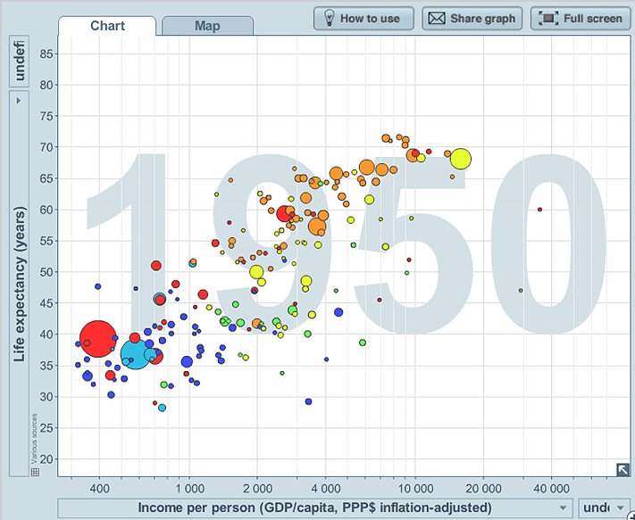
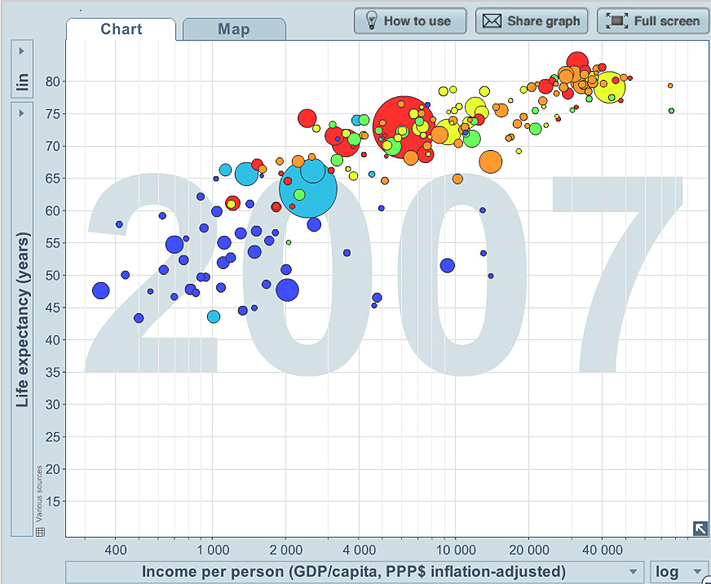
Example I: Life expectancy, income per person, population, world region and time
The plots below show two of the plots in the sequence of plots over years, of life expectancy and income per person for the countries of the world. The population of the country (the third continuous variable) is represented by the size of the bubble, and the region of the world is represented by the colour of the bubble.
We see that there is a relationship, with life expectancy tending to increase as income per person increases, but it does tend to “plateau” and there is much variation, particularly amongst the countries with lower incomes per person, and in African countries in 2007.
Example J: CO2 emissions, income, population, world region and year
Below is a screen capture of one of the plots over time of CO2 emissions (in tonnes per person) versus income per person, for each country, again with bubble size representing population size and with bubble colour representing a region of the world.
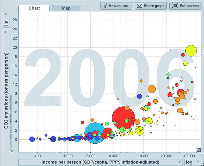
Note that the relationship between CO2 emissions per person and income per person is curved and appears to have less variation than for life expectancy and income per person, but the variation increases as the income per person increases.
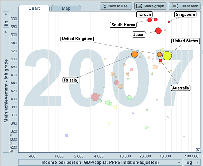
In the dynamic plots on the Gapminder website, the country’s name appears as the cursor moves across a bubble. The next example includes the names of some countries.
Example K: Maths results for grade 8
The plot below is a screen capture of one of the plots over time of 8th grade Maths results, income per person, with the size of the bubbles representing the relevant population and the colour of the bubble representing region of the world. The data are based on an international maths test for children in 4th and 8th grades, from the TIMSS (Trends in International Mathematics and Science Study).
From F-9, students have gradually developed understanding and familiarity with concepts and usage of the statistical data investigative process, types of data and variables, types of investigations and some graphical and summary presentations of data appropriate for the different types of data. Students have planned and carried out data investigations involving different types of variables and used a variety of graphical and summary presentations of data to explore and comment on features of data in relation to issues of interest. In Year 6 they have considered questions or issues involving two or more categorical variables, exploring how data from one categorical variable may be affected by another. In Year 9, students have extended these concepts and experiences to data investigations involving at least one quantitative (mostly continuous) and at least one categorical variable, and used histograms and stem-and-leaf plots on the same scale, and the summary statistics of mean, median and range, to explore and comment on features of quantitative data across categories of a categorical variable, including some concepts of shape of data. Year 10 continues this theme, introducing boxplots as another graphical tool for such comparisons. From this focus on relationships between continuous and categorical variables, Year 10 then moves to consider using scatterplots to explore relationships between quantitative (usually continuous) variables, including examples involving also a categorical variable, and examples available in digital media that follow relationships over time in a dynamic way.
Throughout Years 1-10, in considering more and more aspects of data investigations, students have experienced and discussed the challenges of obtaining randomly representative data, with emphasis on the importance of clear reporting of how, when and where data are obtained or collected, and of identifying the issues or questions for which data are desired to be randomly representative. In Year 8, students used real data and simulations, including re-sampling from real data, to illustrate how sample data and data summaries such as sample proportions and averages can vary across samples. The concepts explored in Years 7 and 8 of the effects of sampling variability and of describing and/or allowing for variability within and across datasets, have been an important part of learning to comment on data in Years 9 and 10.
In exploring the practicalities and implications of obtaining data that can be used to comment on general situations or populations with respect to issues of interest, students have developed understanding of the nature of censuses, surveys, observational studies and experimental investigations.
Throughout, concepts are introduced, developed and demonstrated in contexts that continue the ongoing development of experiential learning of the statistical data investigation process. The examples continue to illustrate the extent of statistical thinking involved in all aspects of a statistical data investigation, including identifying the questions/issues, in planning and implementing obtaining of data, in exploring data and in commenting on information obtained from data in context.
The Improving Mathematics Education in Schools (TIMES) Project 2009-2011 was funded by the Australian Government Department of Education, Employment and Workplace Relations.
The views expressed here are those of the author and do not necessarily represent the views of the Australian Government Department of Education, Employment and Workplace Relations.
© The University of Melbourne on behalf of the International Centre of Excellence for Education in Mathematics (ICE-EM), the education division of the Australian Mathematical Sciences Institute (AMSI), 2010 (except where otherwise indicated). This work is licensed under the Creative Commons Attribution-NonCommercial-NoDerivs 3.0 Unported License.
https://creativecommons.org/licenses/by-nc-nd/3.0/
![]()